Data Visualization
This article will help you understand and visualize data in Python. I would be using Python’s library for the same.
Different Graphs options that one can use for data visualization:
- Bar chart
- Line Charts
- Pie Charts
- Scatter Plot
- Boxplot
It is good practice to use colour and context for the graphs and plots. It becomes important as it gives the reader/ analyser in-depth knowledge what one has done and so better understanding.
Questions that you need to ask yourself.
- What does your data visualization showcase?
- What kind of analysis must be done after doing data visualization?
- What kind of audience will see the data visualization that you carried out?
Different types of Libraries for plotting:
- Matplotlib
- Seaborn
- Plotly
Matplotlib and Seaborn are most used libraries used for data visualization in Machine Learning. I regard Plotly as up there too as it gives the collaborative analysis of the visualized data.
Bar chart, Line chart and Pie chart are used for various different purposes.
- Line chart can be used for data which is continuously changing over time and we need to analyse it over the different time series.
- Bar Graphs can be used for quick comparison of the two or more quantities. It becomes very easy to visualize and conclude about say stock of Apple and Netflix over the same year.
- On the other hand, Pie charts can be best used when the data is categorical, and we need to analyse composition of something.
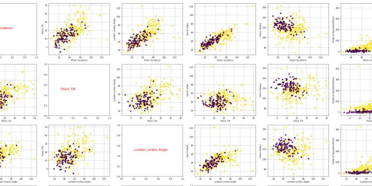
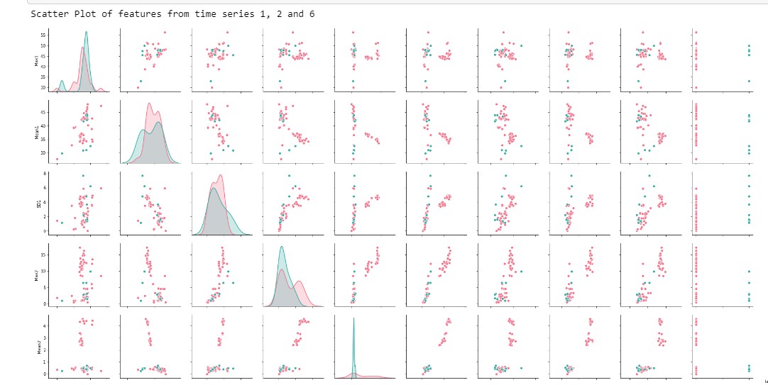
Now, coming over to Scatter Plot and Boxplot:
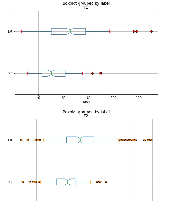
- Boxplot: It is widely used for visualizing the outliers in the data. It gives the mean, 25th, 75th percentile value of data and the points outside the box are referred to as outliers. When handling the machine learning problem, it s good practice to get information about the data first and checking outliers through plotting boxplot is a good way to do it. If there are outliers, we can remove by various methods.
- Scatter Plot: It used for plotting the data values and used for analysing the relationship between variable on X and Y axis. It is often used in regression problem for machine learning.
Libraries guide:
Matplotlib
# loading of library
import matplotlib.pyplot as plt
For Line chart:
plt.plot(x,y)
where x can be continuous variable while y is observation at the particular x
For Bar graph:
plt.bar(x,y)
here x is category names while y is the quantities of it.
For histogram:
plt.hist(x)
where x is the data for which distribution has to be plotted
For Scatter Plot:
plt.scatter(x,y)
For Boxplot:
plt.boxplot(x,y)
It is always good practice to refer to the documentation for more attributes to make the visualization more informative.
Seaborn
#loading the library
import seaborn as sns
Scatter Plot:
sns.scatterplot(x,y)
where x and y are the variables names in the data. It also has parameters like hue, style, size etc which we can referred to official documentation.
Boxplot:
sns.boxplot(x, y, data)
where x and y are the variables names in the data. It also has parameters like hue, style, size etc which we can referred to official documentation.
Plotly
(Link- https://plotly.com/python/)
Plotly is an interactive graphical library.
It gives the user flexibility to look and analyse the graphs with features like zooming, text, coordinates, etc.
We can also see the data on which the data visualization is built on. We also have the feature to view the Python and R code in Plotly Chart Studio. These features are in additional to what we use in daily activities of matplotlib and seaborn.
Also, sharing the data visualization is also possible and thus collaborative. People can comment, share their views in the dashboard and so working with team environment is also super easy.
Thus, plotly is both interactive and collaborative way for data visualization.
We can also used for web-based data visualization and so works with Jupyter notebook as well.
#loading library
import plotly.plotly as py
We need official credentials to access the plotly data visualization which we can done through the website.
Plotly can be used for plotting scatter plots, boxplot, line and bar charts and many other things.